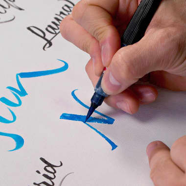
Learn the Basics of Script Lettering
Joluvian shows us how to create a script using brush lettering
Typography, calligraphy and lettering. Here you'll find everything about writing, printing or drawing letters

Joluvian shows us how to create a script using brush lettering
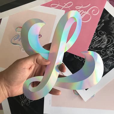
These pro tips from Chisko Romo will give new life to your lettering (and get you more likes on Instagram) Chisko Romo (@chisko_romo) is a graphic designer with more than seven years experience as a lettering artist. Throughout his professional career, he has collaborated with brands such as Adidas, Ted Baker, Moleskine, Apple Music and American Eagle, among many other great brands. He enjoys experimenting with shapes and volumes in lettering, interpreting letters as graphic forms that convey feelings, and creating compositions in different styles that he shares on his Instagram. That's why Chisko has given us three simple tips and tricks that will help you edit your photos or add effects in Illustrator, to turn your compositions into pieces worth showing the world with pride. Here are Chisko’s tips for lettering that will pop: 1. Remove unsightly edges Chisko makes physical letters using engraving and laser cutting techniques, so the final pieces often have burn marks, especially on the edges. To show a perfect piece, without marks or stains, the designer uses the Smudge tool on Photoshop that simulates the effect achieved by passing a finger through fresh paint.
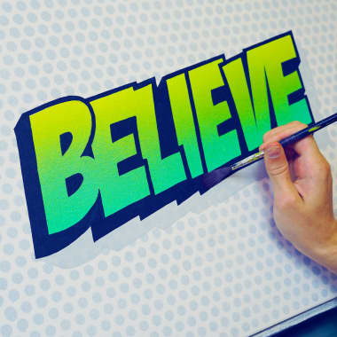
Lettering artist James Lewis introduces us to this technique
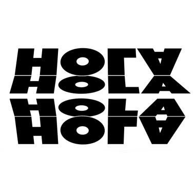
Holke 79 shares his favorite examples of typography in motion Borja Holke, also known as Holke 79 (@holke79), is a graphic and motion graphics designer with over a decade of experience in animation. He works in digital composition, 2D and 3D animation, animated typography, storyboards and publicity.
The lettering artist Nubia Navarro, better known as Nubikini, explains her routine to fight creative block without leaving home Going from working in an agency surrounded by people to managing all your artistic projects from home can be a challenge, even for a creative who is used to managing her freelance commissions alone. Venezuelan graphic designer and lettering artist Nubikini shows us how she lives day to day in this situation, both professionally and creatively, from her studio in Bogotá. She also shares her tips to fight the creative block that can affect us all if we do not exercise our mind during confinement. Find out below:
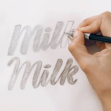
Sindy Ethel shows you techniques to illustrate letters by hand Combining lettering and illustration will help you create unique and eye-catching designs. Bringing these disciplines together will also allow you to experiment with different analog and digital techniques to obtain results that will surprise you. Below, designer Sindy Ethel shows you some simple tricks to familiarize yourself with letter shapes and get you started drawing your own:
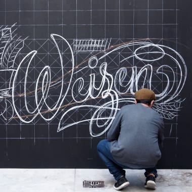
Find out what chalk lettering is and why this vintage style is blowing up once again While it might bring up memories of bad math classes or, for members of Generation Z, movies about bad math classes, chalk lettering is a world away from stuffy classrooms and equations. The intricate discipline has experienced a renaissance in recent years as brands and businesses look to the visual appeal it offers to present their work. Chalk lettering is a discipline of the people. It’s cheap, accessible, and we’ve all done it: everyone remembers scrawling something in chalk as a kid, onto a pavement or in a classroom, getting chalk dust under their nails as they blend their masterpiece or erase a mistake.
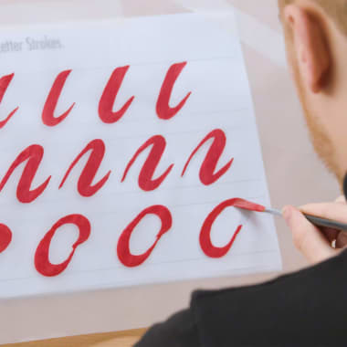
Learn the basics of how to begin hand lettering with James Lewis Hand lettering only continues to grow more popular, and not just as a hobby. Beyond the satisfying time-lapses that are a favorite on social media, more companies are also using hand lettered designs to roll out logos and marketing campaigns. While the effortless elegance of hand lettering is what makes it so visually appealing, it’s also what can make it intimidating to those just starting out. In this tutorial, professional lettering artist James Lewis (@jamesllewis) shares the basics of how to begin with a brush, from how to prepare your materials, to how to position your hands, to even how to correct small mistakes. By practicing these techniques and brush strokes, you’ll be able to learn the basic shapes you’ll need to tackle any lettering project.
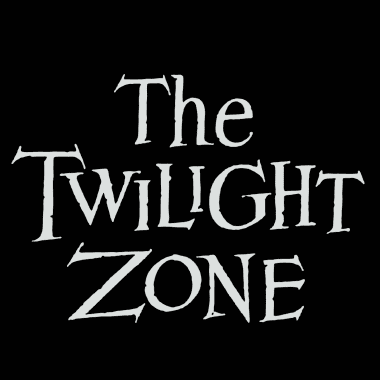
Appreciate ten of the best fonts from series throughout TV history We often remember a television series for its shocking scenes or endearing characters. Their theme tunes can take us back to the first time we saw them. Here we have compiled ten of our favorite fonts that accompany that helped define these shows. The Twilight Zone (1959-1964) A classic series that laid the foundation for fantasy, science fiction, thriller, and horror television. The unmistakable logo invoked a sense of anguish and mystery, of course, accompanied by Marius Constant's musical score. Fonts: Bernhard Mod., Venus
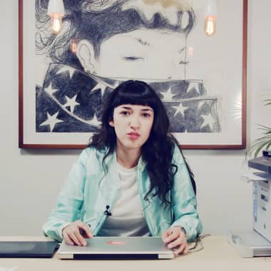
Discover the keys to choosing the most suitable typography for your editorial project with Violeta Hernández Choosing the ideal typography for a project is, for many, the most complicated aspect of editorial design. There is no one perfect typography that can do everything, or universal rules that limit the options available to us, which can make our work very complicated. That's why Violeta Hernández (@soyvioleta), graphic designer, artist, and illustrator, has given us a series of tips to help make this important decision and choose a typography that fits and contributes to our projects. Learn these keys in the following tutorial:

This British artist’s lettering projects certainly stand out, literally and figuratively If you are interested in typography and lettering, it is very likely that you have stumbled upon some of James Lewis' videos on Instagram or TikTok. This British artist has become one of the most viral lettering artists on social media thanks to his amazingly precise and totally hand-drawn 3D characters. Learn more about his work watching his Domestika Live chat. James (@jamesllewis) makes a live logo painting and also discusses the impact that working from home can have on creativity.
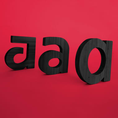
The team at Bauertypes share some basic thoughts about the use of typeface for brand identity
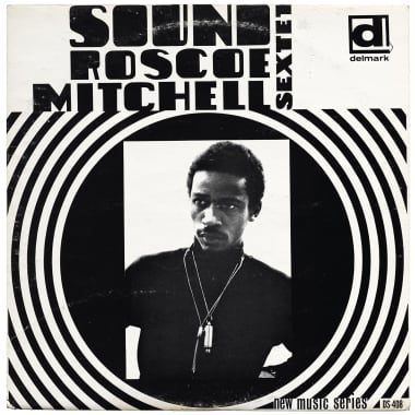
Let the Letterform Archive’s ultra-high quality digital collection inspire your typography Letterform Archive was founded by Rob Saunders, a letter arts collector who wanted to share his collection with the public. They have been a reference for over 10,000 visitors in the last five years, but visiting their diverse collection of typographies, calligraphies, artworks, and texts has become impossible in quarantine. However, whether it’s a loose page from a Qur’an from 1150 or every copy of the boundary-breaking design magazine, Emigre, they’ve gone to extraordinary measures to bring the artwork to you.
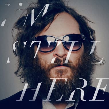
Discover typefaces used in movie posters, promotional materials, and title sequences If you’re a fan of typography, you’re sure to love seeing it on the big screen. From being featured in trailers to staring back at us on movie posters, typography captivates our attention and plays a key role in convincing us that we want to see a film. Here we have put together a list of 10 movies that feature outstanding examples of typography. We share the names of the designers and agencies who worked on them, as well as which fonts they used. It’s important to point out that in some cases the typefaces were slightly modified. Vertigo (1958) The legendary designer Saul Bass created the titles for this spectacular film from Alfred Hitchcock. Just like in many of his other creations, the credits are a fine example of creating a perfect harmony between the typeface and footage, which only a genius like Bass can achieve. These credits laid the foundations for a new school of movie title design. The spiral sequence was created by John Whitney, a pioneer of computer animation, under the direction of Bass. Main Typefaces: Claredom and News Gothic.
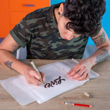
Discover the markers, pencils, and papers that will open up the world of calligraphy When starting out in lettering, it’s essential to learn the basics, like the difference between calligraphy, lettering and typography; the foundations of cursive letters; and the toolkit to practice and achieve fluency and dynamism in your script. That’s why Ximena Jiménez (@jimenezlettering)–a graphic designer specialized in drawing letters of all kinds, shapes, and formats–has shown us how to put together this toolkit so you can begin to paint and draw your own letters.
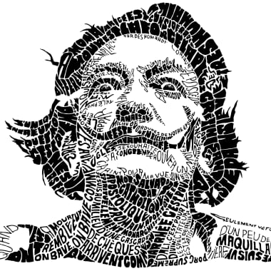
These illustrators play with words and typefaces to create unique and powerful images We know a picture can be worth more than a thousand words. It can also be made of dozens of them. Typographic portraiture is a booming genre in the world of illustration that combines the beauty of lettering with a powerful illustration to create a striking image, often loaded with meaning. These five designers have elevated typographic portraiture into an art. Each of them employs a distinct style but with equally surprising results. Sarah King (@sarahkingart) Inspired by the animal world, science, surf, and snow, Sarah King's illustrations overflow with expressiveness and motivational words. This English artist, now based in Canada, has collaborated with large publications and companies such as the Washington Post, Oprah magazine or the New York Times.
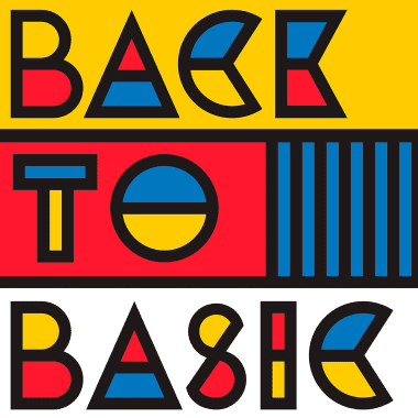
We speak to Alex Trochut about one of the most interesting typography trends right now: color font Alex Trochut (@trochut), works in graphic design, typography, and illustration. He takes language further with innovative letter designs. In a journey of discovery, through fun and amazement, Trochut worked out that words and designs must be legible but can also transmit meaning visually in a less conventional way. We decided he was best qualified to explain what a color font is. Learn more about this new colorful typographic concept, and the impact it can have on digital design.
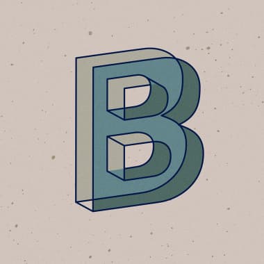
The Mexican designer has created a typeface from the alphabet he designed for 36 Days of Type and he’s sharing it for free 36 Days of Type–the challenge that invites graphic creators from around the world to design an alphabet, making one letter a day for over a month and publishing it on their Instagram profiles–is an incredible opportunity to get inspired and see how others approach the same brief in a completely different way, adapting it to their own styles and skills. It’s also the perfect breeding ground for projects like this typeface by Manolo Guerrero (@bluetypo), the Mexican graphic designer who heads Blue Typo who has shared it completely free for anyone who wants to use it. It’s a completely experimental typeface with which Guerrero wanted to play with perspective, creating a design reminiscent of Escher’s most interesting work.

Learn the techniques to clean, dry, and keep your calligraphy tools in great condition with Bego Viñuela When we finish our work, the last thing we might want to do is clean our tools. However, while our work dries, we have to clean and take care of our them. Calligrapher Bego Viñuela shares how to maintain our brushes, brush pens and watercolor palettes so they last longer.
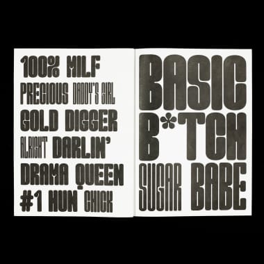
Get to know this young designer and her contemporary approach to type design Marion Bisserier is a French designer, raised in Amsterdam and currently based in London. She recently graduated (with honors) with a BA in Graphic and Media Design from the London College of Communication. She is passionate about type and its potential to visually convey meaning beyond language. She also enjoys writing on typography and graphic design. We talked to her to discover more about her successful type Good Girl, her work experience in important design studios, creative process and practical advice for anyone interested in type design.
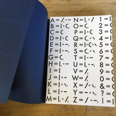
An unexpected perspective on letters as living beings Molecular typography is the study of letters from a radically new perspective. In molecular typography, letters are considered molecules and have certain physical and chemical properties. All characters are formed from seven basic atomic blocks called typtoms. When these are combined, letters, numbers, and punctuation are formed, just as in chemistry different simple elements can form complex molecules.
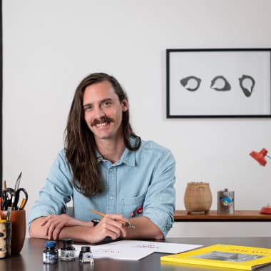
Learn, step by step, how to make this old calligraphy tool, with Joaquín Seguí You may never have heard of calamos, but the truth is that they are one of the oldest handwriting tools in existence. In essence, a calamus is a hollow reed, cut obliquely at one end, which is used for writing thanks to its ability to accumulate ink and allow us to draw on the sheet. Its usefulness in calligraphic writing forms such as the uncial is key, as it allows us to generate compact but organic shapes on the sheet, and also using a callus will allow us to let our hand free if we want to get started in calligraphy. So, if you want to know how to build your own homemade calligraphy callus using just a handful of cheap materials, don't miss the following video tutorial by graphic designer specialized in calligraphy Joaquín Seguí (@joaquinsegui):
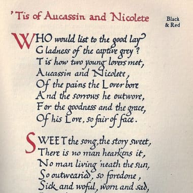
Calligraphy artist Leo Calderón introduces us to Edward Johnston’s type, a writing style that combines aesthetics and functionality
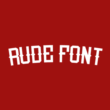
Graphic designer Miguel Nieto shares his typography, Rude Font, with the Domestika community for free Miguel Nieto (@miguelnieto) created Rude Font to fill the need for a typography inspired by the ads at the turn of the 20th century. He imagined a modern adaptation of the classic advertising publications with a touch of street style. The typography found its shape and now we can download it for free as members of the Domestika community.
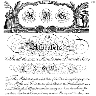
Discover the origins of one of the most elegant and elaborate styles of calligraphy still used today in many prestigious projects
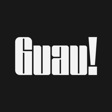
Argentinian designer Lucas Mercado shares an urban art-inspired typeface with the Domestika community, completely free
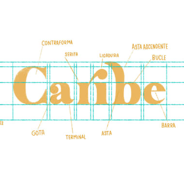
Learn the correct terms for the different parts of a letter and familiarize yourself with its anatomy to better work with them Although letters are part of our daily lives and we see them written in millions of ways, with different typefaces and shapes, there are many of us who do not really know their anatomy. Learning to name each of its parts correctly is just one of the things that we must consider if we want to work with them.
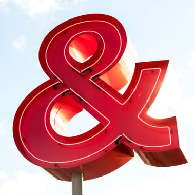
Learn to draw the symbol & with these tricks and tips from Joluvian and apply them to your lettering projects When we start lettering, it’s interesting to begin with the letters and symbols that are most common. That way, we can take what we learn from them and use it on more complicated commissions, adding the tools to our repertoire one by one . In order for you to be able to enter the world of lettering with the best, Joluvian (@joluvian), graphic designer, calligrapher, typographer and illustrator, will share a few tips in the following video on how to draw an ampersand, the well known “&” sign, by hand.